
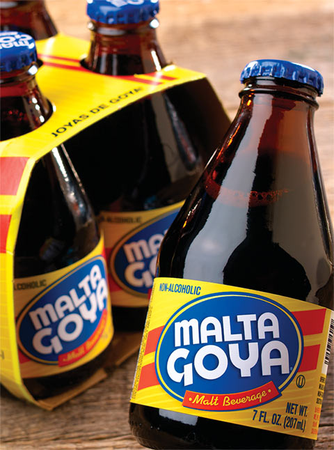
The design directive to redesign a standard of Goya’s product line was a challenge that required ASGP LLC. to determine the equity of the brand and provide a fresh, energenic, contemporary new design all the while maintaining the very familiar elements of the brand that customers have grown to expect while shopping.
We determined that the logo in an oval and the colors needed to be maintained. In order to make the design more dynamic all graphics are put on an angle with strong red bands for reinforcement of movement and energy. The blue bottle cap color completes a strong and impactful branding.
The branding was applied to various bottle sizes and wraps as well as shippers.
Leave a Reply
You must be logged in to post a comment.